KARAAGE SPREAD
The magazine spread shown on the right was designed with the purpose of telling a story associated with one of my favorite foods: Karaage. It uses red and other warm tones to help get the viewer in the mood to eat as well as to compliment the cool colors of the pan in the illustration. The illustration was painted by me in Clip Studio Paint. It focuses on showing an energetic scene of raw meats like chicken and beef flying into the pan and having them fly out as the fried pieces of meat. With this, it led to a bit of a fun layout in terms of the text by having it wrap around the shape of the bottom of the pan.
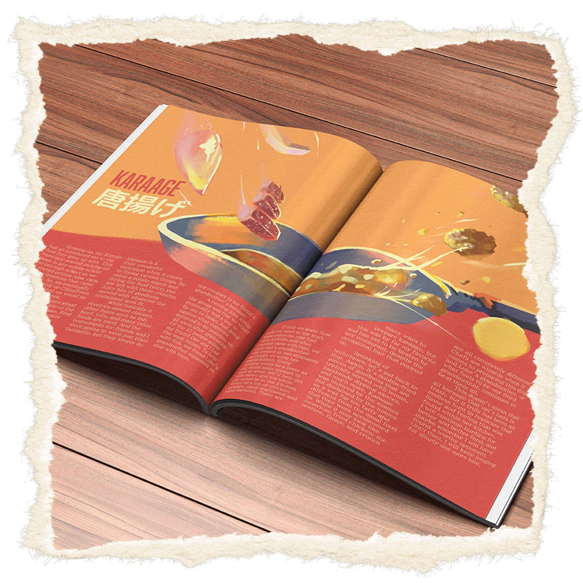